
Recently, as Labour has overtaken the Conservatives in national polling, the LeanTossup Westminster model has shown wildly divergent results from other UK models.
When Labour’s lead expanded to 10 percent nationally , or more in some instances, other models have shown large seat gains for Labour, and a Labour majority government.
However, contrary to these other models, the LeanTossup model continues to show worse results for Labour. At best, the model showed a seat lead for Labour of about 20 seats over the Tories, with Labour at around 300 seats, still 26 away from a majority. Now, with the Tories regaining some of that support, we show the Tories winning more seats, while other models still show Labour with not only more seats, but closer to a majority than our model has ever shown.
So, the question is, why does the LeanTossup model show the Tories consistently doing better than other models?
One of the reasons why is because our model is fundamentally different from other models that are more bullish on Labour.
Some critics have pointed to results where the LeanTossup model has Labour gains in some regions, but smaller Labour gains in others, compared to other models which show more of a uniform swing throughout the country. The reason for this is because most other UK models utilize the concept of “Uniform National Swing”, the theory that if you take the difference between the current support level for one party, and their level of support in the last election, and then apply that swing evenly across the country, then you get the best approximation of what the end result will be.
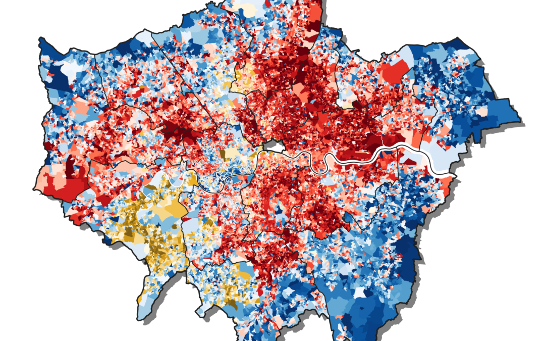
We here at LeanTossup believe that the concept of “Uniform National Swing” is outdated. This concept stems from decades of UK election night results in which the use of the swingometer, a pendulum represented by Big Ben’s clock face that shows the direction and magnitude of the swing to each party from the previous election. While that number is indeed useful, and unfortunately seldomly used outside of the UK, that number is averaged nationally. This is crucial, as many seats are above or below that average, and not all of them have the same magnitude or even direction of swing. In the 2019 election, Labour faced a swing against them of more than 20 points in several Northern “Leave” leaning seats, while facing much smaller swings against them in London and other Southern “Remain” leaning areas.
Those results alone should be enough to completely throw out the Uniform National Swing models, but still they remain. We know they are still being used by other models, as they are able to rapidly put out new model projections when a new “shock” poll is released. That is notable, as when most poll results are released in the UK, they are released by media outlets first, with just the topline revealed, with the full crosstabs being released the next day.
If other models were using sub-national or demographic crosstabs, then they would take much longer to release a model update after new poll releases.
Additionally, the LeanTossup model takes the averages of regional crosstabs. We average polling numbers from the main polling regions of the UK: Scotland, Wales, London, North, Midlands, and South. Sometimes, that gives us anomalous results. We are looking for more ways to make our model less sensitive to irregular regional crosstabs, particularly in London or Wales, where there is the most prominent amount of regional variation between pollsters. We have made some adjustments already that should make those numbers more stable, but we are still working on it going forward. However, we are still far more confident in using those regional crosstabs, even with their more volatile regional variation, as a polling average of a particular region is still the best indicator of how it will vote in the next election, regardless of how it should move according to a mythical “Uniform National Swing”.
According to the most recent polling, Labour’s gains are not uniform across the country, but are more concentrated in some regions than others. Let’s look at those same two polls, and their regional crosstabs as compared to 2019:
2019:
North: Lab 43.2- Con 39.6 (Lab+3.6)
Midlands: Con 54- Lab 32.9 (Con+21.1)
South: Con 54.5- Lab 23.1 (Con+31.4)
Survation: January 25 2022, Lab 40.3-Con 34.8
North: Lab 52.6- Con 33 (Lab+19.6)
Midlands: Lab 44.5- Con 43.5 (Lab+1.5)
South: Con 42-Lab 36.9 (Con+5.1)
Opinium: January 27-28 2022, Lab 39-Con 34
North: Lab 46- Con 35 (Lab+11)
Midlands: Lab 48-Con 38 (Lab+10)
South: Con 39-Lab 32 (Con+7)
While the polls disagree as to how large the swing to Labour is in the North and Midlands, both point to a similar picture: Labour has gained more voters in the Remain heavy South than the Leave heavy Midlands and North. From 2019, Labour has gained ~9 points in the North according to Survation and only ~3 points according to Opinium, which the Tories are only down ~6 points by Survation and ~4 by Opinum, which is significantly smaller than what the “Uniform National Swing” would predict. While other models have Labour making gains in Northern seats, particularly Leave heavy Northern seats, the LeanTossup model looks at lower Labour gains with Northern voters than in other parts of the country, and their lower gains with Leave voters as well, and it has the Tories holding many of the seats they have won from Labour over the last decade.
Another point of criticism that our model has received is that it relies too heavily on “The Brexit Vote”, and that Brexit is over and no longer relevant. To that criticism we would say that people are taking what a “Leave” or “Remain” voter is too literally. While yes, all “Leave” voters elected in June of 2016 to Leave the European Union, and “Remain” voters elected to Remain in the European Union, there are still lingering identity issues at play that go beyond just how they voted in the referendum. Think of a poll of Leave/Remain voters more as a demographic poll. Voters than identify with “Leave” tend to be older, have a lower level of education, less wealthy and tend to live more in the North. “Remain” voters tend to be younger, higher levels of education, higher standard of living, and then to live more in the South. In this way, a poll of voters on either side of this divide gives us far more demographic information about voters rather than just how they voted in the 2016 Referendum.
We believe that the concept of political identity in the UK has fundamentally shifted. Studies conducted since the referendum, such as this one from “The UK in a Changing World”, show that the number of both Remainers and Leavers expressing a Brexit identity grew markedly following the referendum result. Even in mid-2018, two years after the referendum, only just over 6% of people did not identify with either Leave or Remain. Compare this with party attachment. The percentage of respondents who said they have no party identity increased from 18% to 21.5% over that same period. Only one in 16 people don’t have a Brexit identity whereas more than one in five have no party identity.
While many people believe that the LeanTossup model has an overweight of the Brexit vote, what they are actually missing is that voter identity has shifted away from what has been just the traditional Tory/Labour divide, and that this identity shift will continue to persist and manifest through future election results, even when those particular elections have nothing to do with Brexit.
The evidence of this can be seen through the crosstabs of the current polling. Let’s look at the last two 2019 election polls, from Opinium and Survation, taken on the eve of the 2019 election. These two polls were selected because they are two of the last polls with crosstabs, and are also closest to the final result:
Actual Result: Con 43.6- Lab 32.1 (Con+11.5)
Survation: Con 45- Lab 34 (Con+11)
Opinium: Con 45- Lab 33 (Con+12)
What did those polls say about how Leave and Remain voters were casting their votes:
Survation:
Leave: Con 73.6- Lab 13.3 (Con+60.3)
Remain: Lab 51.1- Con 19.9 (Lab+31.2)
Opinium:
Leave: Con 73- Lab 15 (Con+58)
Remain: Lab 46- Con 21 (Lab+25)
Let’s look at those two pollsters, and what they are showing today:
Survation: January 25, Lab 40.3-Con 34.8
Leave: Con 52.9- Lab 25.5 (Con+27.4)
Remain: Lab 50.5-21.8 (Lab+28.7)
Opinium: January 27-28, Lab 39-Con 34
Leave: Con 54-Lab 23 (Con+31)
Remain: Lab 53-Con 18 (Lab+35)
So, a few things stand out. One, Labour have made gains with their margin with Remain voters, but only through Conservative weakness with them. While Labour has also lowered their losing margin with Leave voters, they have only increased their vote share by about 10%, while the Conservatives have lost about 20% of theirs. That additional 10% has gone to other parties.
Another thing that stands out is that, if you average the Leave/Remain crosstabs using the 2016 Referendum results (52-48 Leave) then you get a much closer race than the polls are currently showing.
Survation:
2022 Recent Poll: Lab 40.3-Con 34.8 (Lab+5.5)
2022 Crosstabs: Con 37.9-Lab 37.5 (Con+0.4)
Opinium:
2022 Recent Poll: Lab 39-Con 34 (Lab+5)
2022 Crosstabs: Lab 37.4-Con 36.7 (Lab+0.7)
Additionally, these are two pollsters that have smaller Tory leads than other pollsters in the field right now (but are being used because of their more accurate 2019 result). When looking at all of the pollsters that publish Leave/Remain crosstabs, many are showing even better numbers for Labour nationally, while still showing a close or tied race by averaging Leave/Remain according to the 2016 referendum result. Obviously, averaging by the 2016 result is not best practice, as there are reasons it should not perfectly match up to the National Topline, but it should still be close, rather than the 5+ percent it is currently off by.
For these reasons, we still have faith in the LeanTossup model, and believe that it is correct in projecting smaller Tory losses in the North than other models. The model also showed substantially different results from other models in the 2019 election, and it was the most accurate of all of them, including the YouGov MRP. We believe that by using a non-uniform swing model, and demographics that include Leave/Remain crosstabs, it gives us a better national picture than other models that do not use that data. As we have local elections coming up in the UK in May (and we will have projections for those) we will get real world voting data to see if our model is pointing in the correct direction. We welcome criticism, and if the model is wrong in May we will look to update our methodology, but for now we are sticking with the model.